Making the WebSphere Console look distinct
The problem
As a response to a StackOverflow question, Changing websphere admin console interface color, I decided to create a Stylish script to allow a user to visually distinguish the various WebSphere console environments they might access.
To me, this seems a very wise thing to do for anyone who manages multiple environments. (We’ve taken to actually styling our Development and Test end-user websites in a similar manner so people don’t accidentally perform testing in the wrong environment.)
WebSphere’s built-in solution
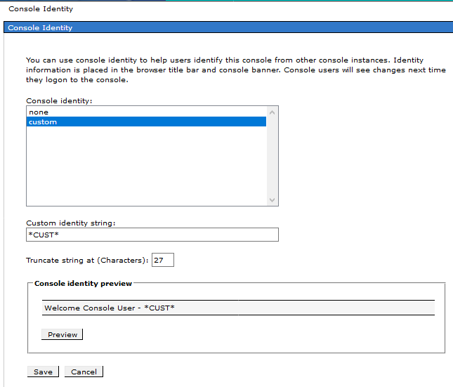
Note also another useful answer there that the WAS console does have a built-in mechanism for adding a custom text string to the banner. You can set this custom string in the System Administration > Console Identity > Custom identity string field.
Something more drastic
But the Stylish approach allows you to make some more obvious, drastic visual difference.
This script styles the #ibm-banner-main element by adding a background color to it. The effect looks like this:
(Where the “CUST” string is the aforementioned “Custom identity string”.)
Copied from my StackOverflow answer, the content of the Stylish script would be:
    @namespace url(http://www.w3.org/1999/xhtml);

    @-moz-document regexp("https://your-server:9043/ibm/console/.*") {
      #ibm-banner-main {
        background-color: cyan !important;
      }
    }
Replace ‘your-server’ and potentially the ‘https’ and port, as appropriate.
You can list multiple @-moz-document sections if you want a single script for different environments (Development, Test, Production, etc.)
Which element to style
The way I determined which ID or class to style was using my browser’s Development Tools “inspect this element”. Using this investigative technique, other elements of the page could be discovered to style instead or in addition.
